This page was created by Anonymous.
Comparative Chart by Category: Interface
This section highlights the differences between Wharton's Manuscript of Summer (MSS), the McClure’s Magazine Edition (MME), the First American Edition (FAE) and the First British Edition (FBE) in terms of layout, spacing, and paragraphing. I group them under interface because all these aspects are related to how we visualize a text.
**While reading the next paragraphs, click the hyperlinked words or phrases to see the associated media content. When you click a small box will appear. This box has a smaller view of the media content. For a full view of the media content, click "go to note" option at the bottom of the box.
Layout
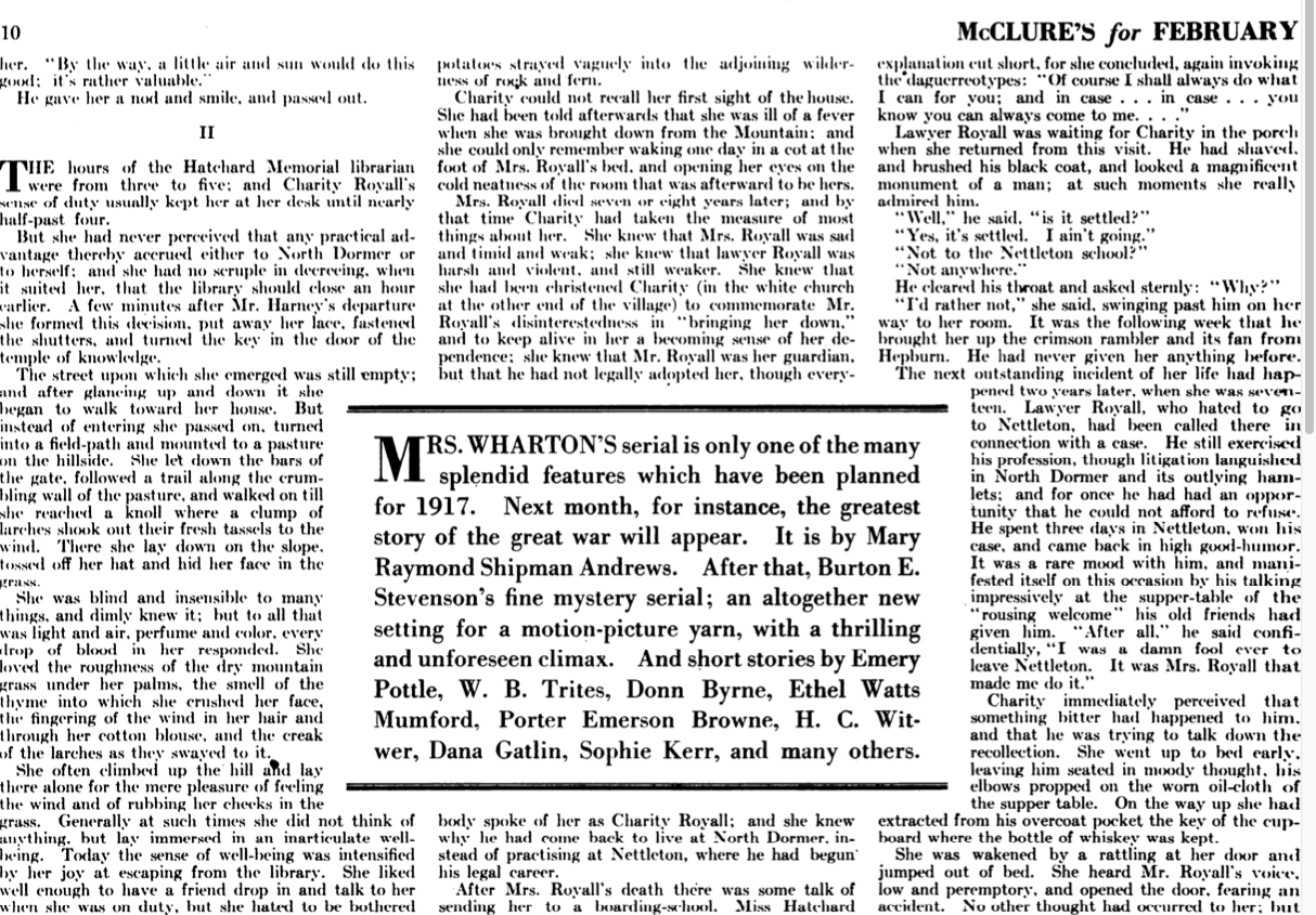
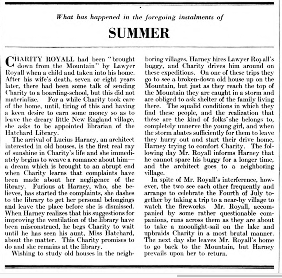
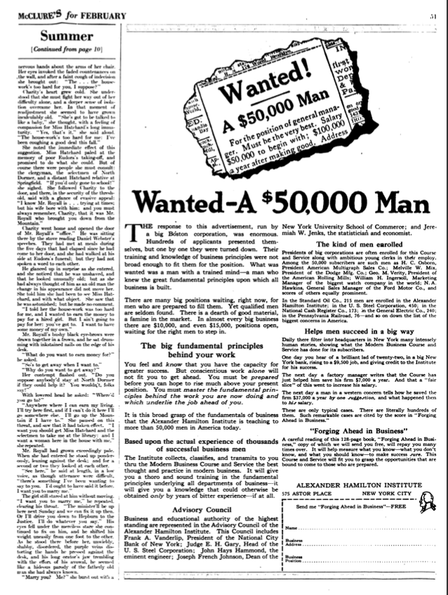
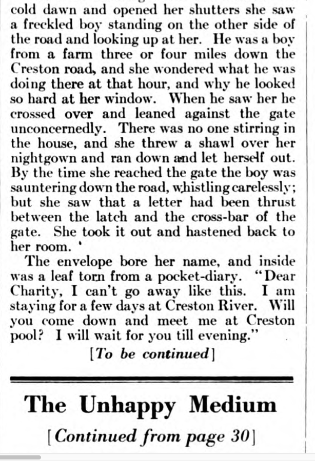
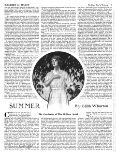
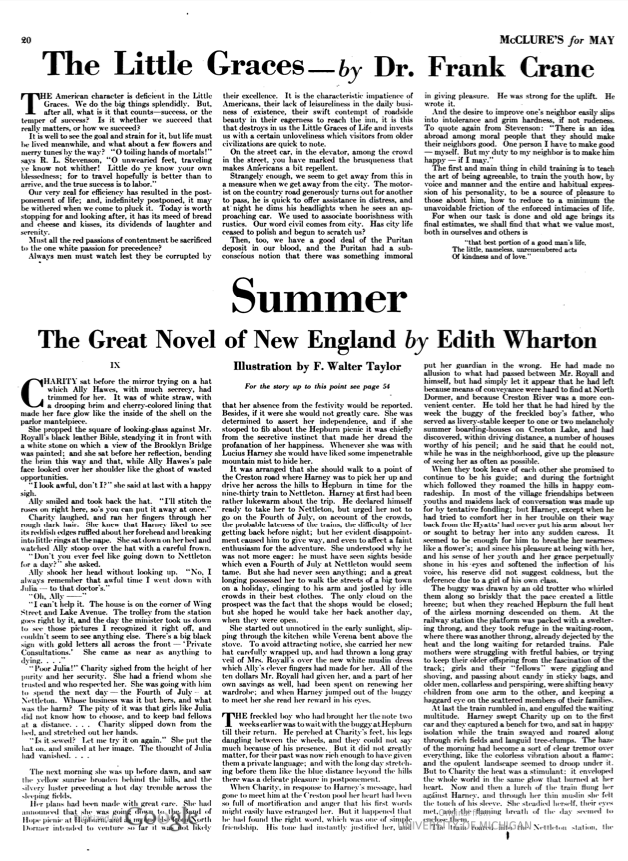
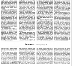
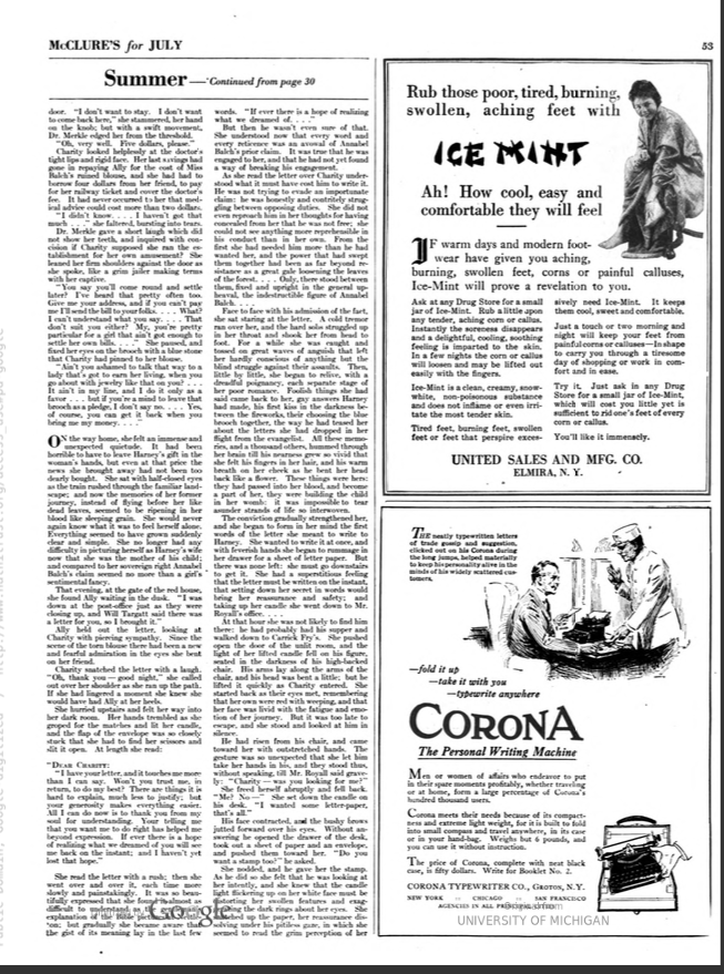
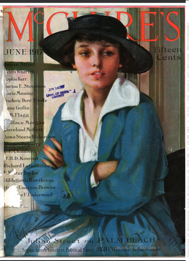
There are differences among a manuscript, a magazine, and a book in terms of layout. But some differences are really interesting. While both the FAE and the FBE have linear path to the story, the serialized edition has a non-linear way of presenting the story. In all the installments, there is a narrative break in the middle. For the serialized edition of Summer, McClure's Magazine devoted six to eight pages per installment. In each installment, half of the content (including an illustration) are placed somewhere within first 30 pages. The other half is placed 15-20 pages later. The break is random and does not follow any chapter break. Even within the narrative, literary pieces by other writers or different kinds of advertisements are inserted that further breaks the flow of the narrative. In addition, the serialized edition comes with a summary of the previous installments so that readers can catch up if they have missed the earlier installments, and a short description of the upcoming issue (an attempt to create suspense) so that readers are willing to buy the next issue. One interesting aspect of the serialized edition is that it uses sales pitch with each installment of Summer, “great author,” “famous illustrator,” or “great New England novel.” Also, Wharton’s name has been used to advertise the installments of other literary pieces that McClure’s Magazine published. In his biography of Wharton, R. W. B Lewis mentions how elated the Editor was to receive Wharton's work for McClure's:
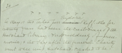
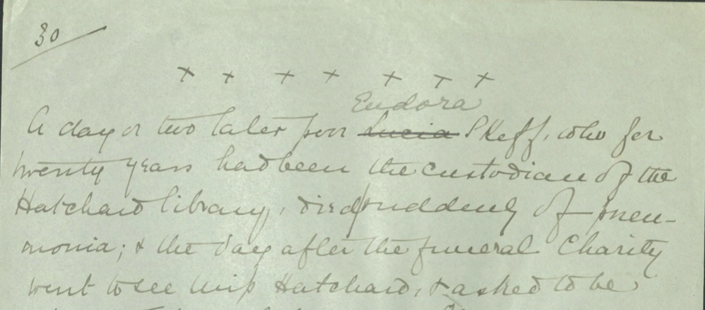
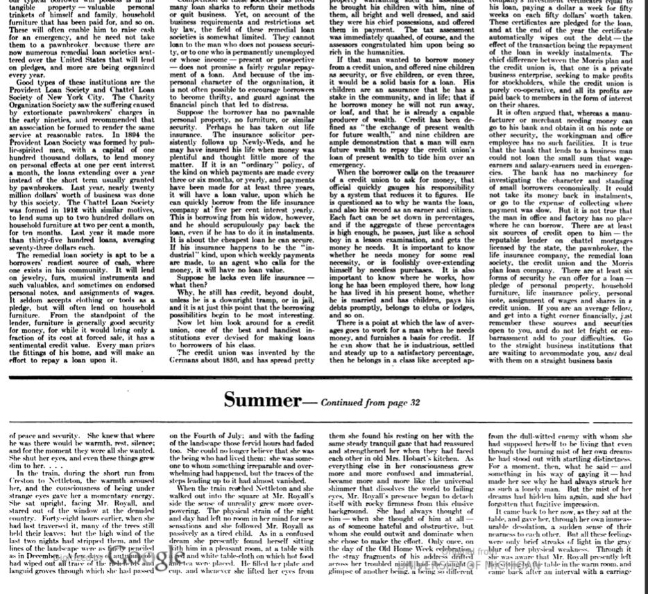
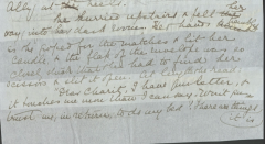
Note that, the MSS also exemplifies non-linearity since Wharton has inserted written notes or pasted shredded papers with notes for a different page, breaking the linearity of the story. See these examples: Example 1; Example 2For Summer the editor at McClure's, saying that he had never in life been so happy to get hold of a serial, paid seven thousand dollars, and raised the price of the magazine to fifteen cents. (396)
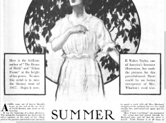
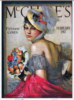
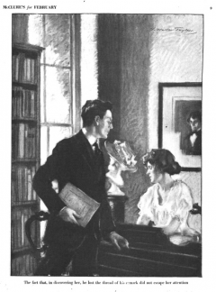
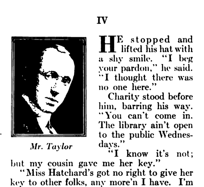
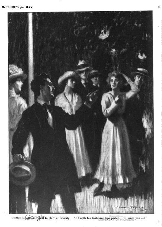
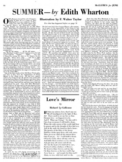
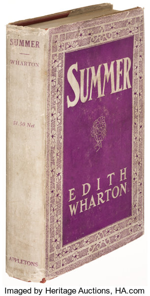
In addition to the layout, another major difference between the MME, the FBE, and the FAE is the inclusion of illustrations. The MME included one illustration per issue, except the first issue (February 1917) that included two illustrations. The illustrations were done by F. Walter Taylor. The FAE or the FBE did not have any frontispiece or illustration in the book. I noticed one interesting aspect of the illustrations. Even though McClure's Magazine claims that Taylor fully understands Wharton's novel and faithfully depicts the story in his illustrations, the illustrations only focus on the development of Charity's character. The illustrations do not focus on the other character whom we see in a different light after Charity's transformation––Mr. Royall. No wonder Wharton did not like illustrations for her novels! However, as R. W. B. Lewis mentions in his biography of Edith Wharton, Wharton's move from Scribner's Magazine to McClure's Magazine "marked the opening of a long period during which she would take in even larger amounts of money, chiefly for serial rights in widely selling "picture magazines"" (396).
For viewing a gallery of the illustrations of Summer from McClure's Magazine, click here.
Spacing
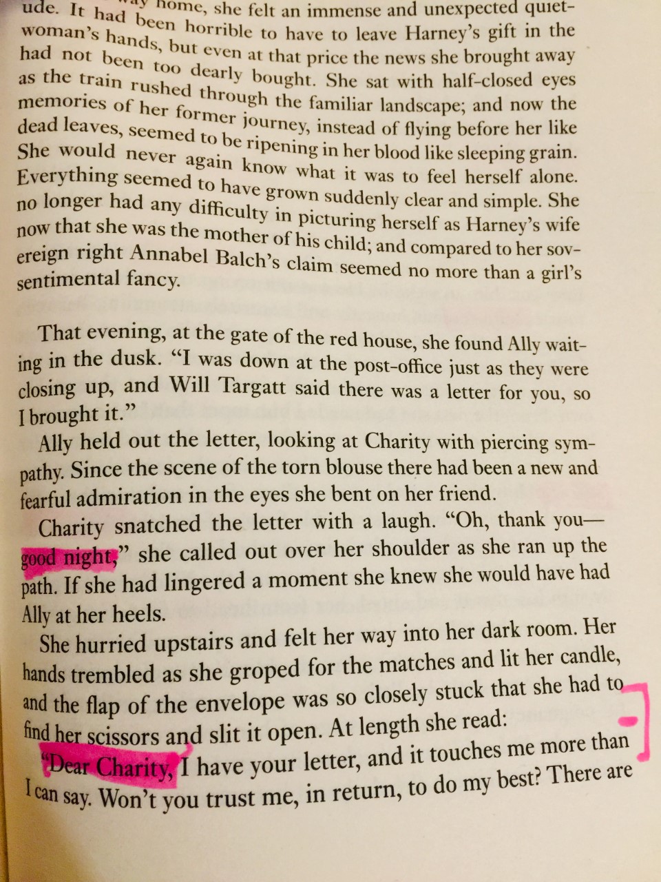
The comparative chart at the end of this page highlights the differences between the FAE and the FBE in terms of paragraph break. So far what I have seen of the MSS, the FAE and the FBE follow Wharton's direction for "one line space." However, in one instance in the MSS, Wharton has written a line of 7 crosses to indicate a section break (MSS 30, f. 352) and the FBE uses double space and a line of dots to follow Wharton's direction for page break (FBE 15). However, the MME (10, Feb 1917) and the FAE do not include any crosses or dots in that section (FBE 30), rather use double space to mark section break. As the chart will show, there are several instances where the FAE uses regular single space while the FBE uses double space between paragraphs.
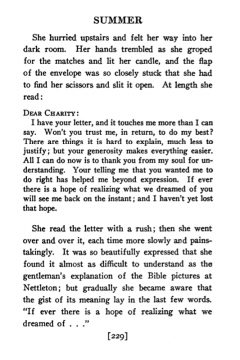
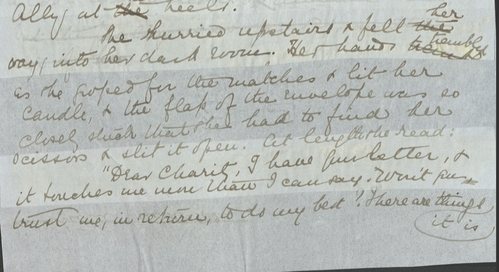
In addition, as the chart illustrates, the FAE and the FBE use different styles for letters. In the FAE, all the letters are separated with double space from the main paragraph and presented in the format of a letter. Also, the FAE does not use quotation marks for the letters. However, in the FBE, all the letters are part of a running paragraph and marked with quotation marks, like regular dialogue. However, in one instance, the FBE separates the letter from the main paragraph, but still uses the quotation marks. The reason might be to align the style with the style Wharton has used in the MSS for that particular letter. In general, the MSS (so far what I have seen), the MME, and the FBE use quotation marks for all the letters. The MME uses a combination of both depending on the availability of space I guess. Similar to the FAE, the MME separates this letter from the main paragraph using double space, even though it retains the quotation marks (the MME 53, July 1917). However, on page 67 of the April 1917 issue of the MME, the letter is part of a running paragraph (similar to the FBE p. 63). However, like the FBE, the MME uses quotations marks in all the letters.
Another instance of spacing that I did not include in the complete comparative chart is the spacing between lines and characters. The MME and the FAE uses longer space between the period and the next line, while the FBE mostly uses single space. Since I do not have the original copy of the First British Edition, I decided not to include this difference among these editions in the comparative chart. Also, there are a number of instances where the FAE uses more space between characters than the FBE. It seems that the difference of spacing is the result of different typesets used by different publishing houses.
Comparative Chart: Interface
| No. | Chapter & Criteria | Summer, First American Edition (FAE) | Summer, First American Edition with Wharton’s corrections (EWPFAE) | Summer, First British Edition (FBE) |
| Ch 1 Para Break | He laughed … again. “Haven’t you . . . room. (18) | He laughed . . . room. (two sections are put together as a single paragraph) (9) | ||
| Ch 2 Section Break | . . . cold to the bone. (30) (uses double space to indicate break) | . . . cold to the bone. (15) (uses double space and a line of dots to indicate break) | ||
| Ch 3 Para Break | . . . received his infrequent clients. Professional dignity . . . (36) | . . . received his infrequent clients. (paragraph break; regular/single space) Professional dignity . . . (18) | ||
| Ch 6 Para Break | . . . behind an outhouse. Harney jumped . . . (82) | . . . behind an outhouse. (paragraph break; regular/single space) Harney jumped . . . (42) | ||
| Ch 6 Para Break | “Oh, Charity—” It was the first . . . (88) (paragraph break; regular/single space) “I ain’t ashamed . . . (88) | “Oh, Charity—” (paragraph break; regular/single space) It was the first . . . “I ain’t ashamed . . . (45) | ||
| Ch 8 Para Break | She took it and went up. (Not sure if single or double space because the next paragraph begins in page 109). The morning hours of the next day . . . (108-109) | She took it and went up. (paragraph break; double space) The morning hours of the next day . . . (56) | ||
| Ch 8 Para Break Letter Style | In FAE, all the letters are separated with double space from the main paragraph and presented as properly formatted letter. No quotations marks. . . . a pocket-diary. DEAR CHARITY: . . . (123) | In FBE, all the letters are part of a running paragraph and marked with quotation marks, like regular dialogue. . . . a pocket-diary. “Dear Charity . . . (63) | ||
| Ch 11 Para Break | . . . as he held her against it. “Kiss me again––like last night,” . . . (169) (two separate paragraphs) | . . . as he held her against it. “Kiss me again––like last night,” . . . (87) (two paragraphs are combined) | ||
| Ch 14 Chapter Opening | NORTH DORMER’S celebration naturally included . . . (200) | NORTH Dormer’s celebration naturally included . . . (104) | ||
| Ch 15 Paragraph Space | . . . she fell sobbing across her bed. (Regular/single space) The long storm was followed by . . . (219) | . . . she fell sobbing across her bed. (Double space) The long storm was followed by . . . (114) | ||
| Ch 15 Letter Style | In FAE, all the letters are separated with double space from the main paragraph and presented as properly formatted letter. No quotations marks. (221) | In FBE, all the letters are part of a running paragraph and marked with quotation marks, like regular dialogue. (116) | ||
| Ch 15 Paragraph Space | . . . as if her feet were lined with glue. (Regular/single space) Two days later, she descended from the train . . . (223) | . . . as if her feet were lined with glue. (Double space) Two days later, she descended from the train . . . (116) | ||
| Ch 15 Letter Style | In FAE, all the letters are separated with double space from the main paragraph and presented as properly formatted letter. No quotations marks. The letter begins with DEAR CHARITY (229) | In FBE, all the letters are part of a running paragraph and marked with quotation marks, like regular dialogue. The letter begins with “Dear Charity” (119) | ||
| Ch 18 Paragraph Space | She understood then that she was married. . . . (Regular/single space) Late that afternoon . . . (278) | She understood then that she was married. . . . (Regular/single space) Late that afternoon . . . (278) | She understood then that she was married . . . (double space) Late that afternoon . . . (147) | |
| Ch 18 Paragraph Space | . . . she let her head sink on the pillow. . . . (Regular/single space) When she woke the room was full of morning light, . . . (284) | . . . she let her head sink on the pillow . . . (double space) When she woke the room was full of morning light, . . . (149) | ||
| Ch 18 Letter Style | In FAE, all the letters are separated with double space from the main paragraph and presented as properly formatted letter. No quotations marks. . . . on the sheet of paper she wrote: I’m married to Mr. Royall. . . (289) | In FBE, all the letters are part of a running paragraph and marked with quotation marks, like regular dialogue. . . . on the sheet of paper she wrote: “I’m married to Mr. Royall. . .” (159) |
This page has paths:
This page references:
- Sales Pitch! McClure's Magazine
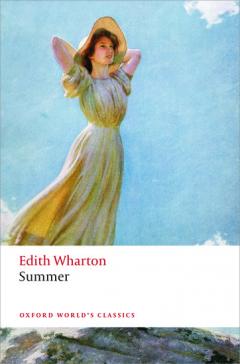
- Book Cover: Reproduction of First British Edition of Edith Wharton's "Summer" (McMillan 1917), Oxford World's Classics, 2015
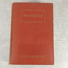
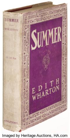
- Book Cover: First American Edition of Edith Wharton's "Summer"
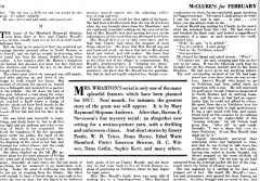
- Advertisement for Other Literary Pieces, McClure's Magazine, p. 10, February 1917
- McClure's Magazine: Style of Letter
- Magazine Layout: Recap (Brief Summary of the Previous Installments)
- Book Layout: Page
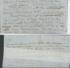
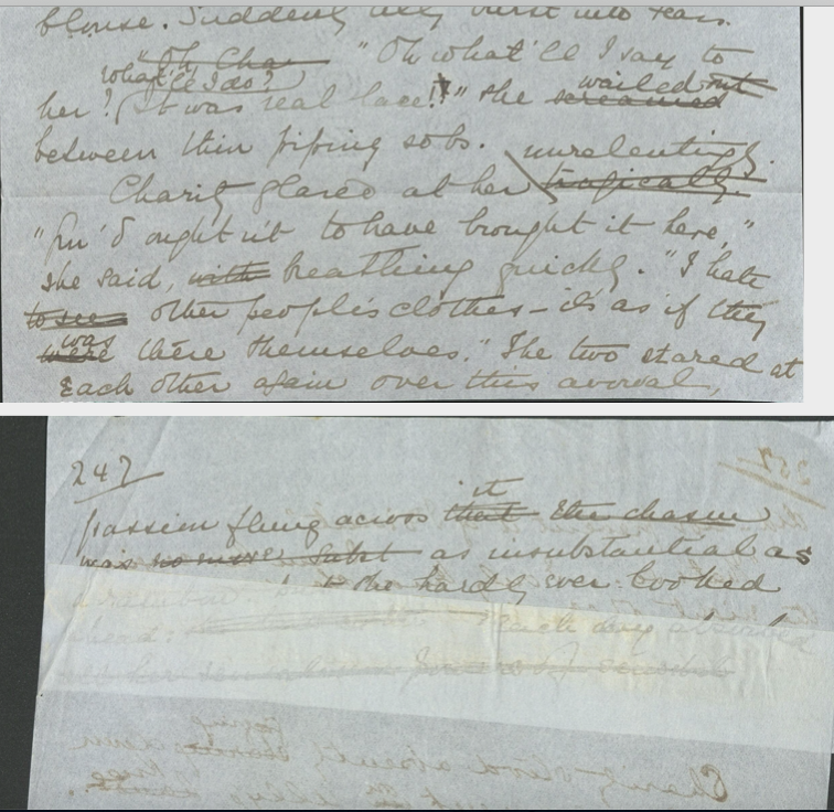
- A page from Wharton's Manuscript
- Advertisements within the Novel, McClure's Magazine
- Book Layout: Letter Style
- McClure's Magazine: Style of Letter 2
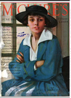
- McClure's Magazine Cover, February 1917 (The installments of "Summer" begin from this issue)
- Illustration in McClure's Magazine
- Final Installment of the Serialized Edition of Edith Wharton's "Summer"
- Book Layout: Letter Style
- Image of Mr. Taylor, Illustrator for McClure's Magazine Edition of "Summer"
- Wharton's Crosses
- Magazine Layout: Page
- Magazine Layout: Non-linearity
- Another example of Wharton's non-linear writing style
- "Mr. Royall continued to glare at Charity. At length his twitching lips parted. "I said: you––!""
- Information about the Upcoming Issue, McClure's Magazine
- Magazine Layout: Table of Contents
- Insertion of Other Literary Pieces, McClure's Magazine, p. 24, June 1917
- Couldn't Help Sharing This Advertisement of "Corona Writing Machine," McClure's Magazine, p. 53, July 1917
- Dust Jacket: First American Edition of Edith Wharton's "Summer"
- Wharton's Non-linear Writing Style
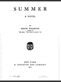
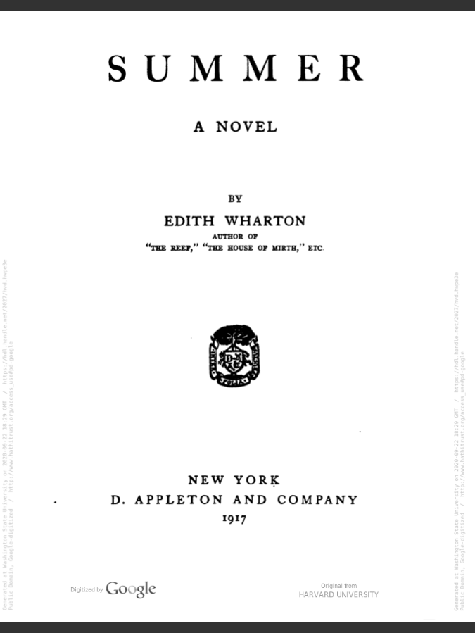
- Book Layout: Title Page
- Wharton's Style of Letter
- McLure's Magazine